Warm White or Cool White? Comparing the Feel of Two Wall Colours
Compare warm white or cool white beside your room’s fixed finishes, so you can choose a wall colour that sits comfortably with floors, stone and wood.
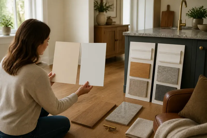
At the kitchen table, a warm-white paint card may look creamy beside a grey worktop, while a cool white can seem faintly blue against oak flooring. Choosing warm white or cool white is easier when you judge each sample beside the finishes that will stay in the room. The right one is not the white that looks pure on a card; it is the one whose undertone makes the existing materials feel at ease.
Start with the undertone, not the name
White paint is rarely neutral in every setting. A warm white carries a hint of yellow, red or brown; a cool white tends towards blue, green or grey. The difference can be quiet on a small chip and pronounced across a wall, particularly next to a strongly coloured surface.
Paint names offer clues, but they are not a reliable colour map. “Ivory” often suggests warmth, and “chalk” may suggest a cleaner cast, yet each maker uses names differently. Compare the actual swatches under the conditions in your room, and notice whether each appears creamy, rosy, greenish or blueish beside a plain sheet of white paper.
The aim is not to remove every undertone. It is to understand which one is already present in the room and decide whether the wall should echo it or provide a deliberate counterpoint.
Choose warm white when the fixed finishes lean warm
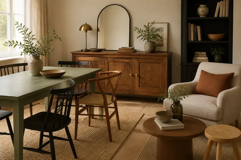
Warm white often sits comfortably with honey-coloured oak, pine, terracotta, beige stone, brass and textiles with a red or ochre cast. It can soften the boundary between a pale wall and these materials, so the room reads as a connected group rather than a collection of competing shades.
This can suit a north-facing room, where daylight often appears cooler, but aspect alone should not decide the paint. The floor, worktop and large pieces of timber still matter more than a rule about which way a window faces. A warm white beside a green-grey stone surface may emphasise the stone’s coolness; that contrast may be welcome, or it may make the wall seem yellow by comparison.
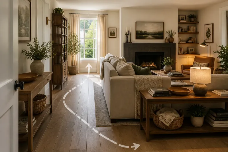
Say you have a sitting room with amber-toned floorboards and a brown leather chair that will remain. You place a warm-white sample and a blue-leaning white on separate boards beside the floor. If the warmer sample makes the boards look settled and the cooler one makes them appear orange, the warm option is likely the more harmonious choice. If the warmer sample turns the leather dull, the cooler one may give the room a cleaner balance.
Choose cool white when the permanent elements already look cool
Cool white can work well with blue-grey stone, stainless steel, charcoal tile, cool-toned concrete and fabrics that lean towards blue or green. It may make these finishes feel crisp and related, rather than leaving the wall looking creamy beside them.
In a room with little direct sun, a cool white can also preserve a clear, restrained appearance. But a very blue undertone may make a dim room feel stark, especially beside dark flooring or a grey surface with a green cast. A soft grey-white may be easier to live with than the brightest, coldest sample.
Warm finishes are not automatically ruled out. A cool wall can make reddish timber stand out as a considered contrast. The useful question is whether you want the wood to appear warmer and more distinct, or whether you would rather the wall blend quietly with it.
Read samples alongside the surfaces that will stay
Gather samples near the largest fixed elements: flooring, kitchen worktops, stone, tile, built-in cupboards and substantial timber. A small decorative object can be moved; these surfaces usually set the room’s lasting colour relationships. Compare the samples vertically, since a wall is seen upright rather than flat on a table.
Keep the comparison simple. Put a warm and a cool sample side by side on white card or separate sample boards, and move them next to each key finish. Check them in daylight and again under the room’s usual lamps. A white surface can shift from creamy to grey as the light changes, so a sample that suits the floor at midday may feel different after dusk.
- Beside oak or pine, check whether the wall makes the timber look yellow, orange or comfortably natural.
- Beside grey stone or tile, see whether the sample looks creamy, blue or unexpectedly green.
- Beside brass or copper, decide whether a warmer wall joins the metals or makes them feel too golden.
- Beside white trim, compare the two whites directly; one may make the other appear dull or tinted.
- Beside a large sofa or curtain fabric, check whether the undertones agree even when the colours are not identical.
Ignore small differences that disappear at normal viewing distance. Trying to find one universal white that matches every object is rarely worth the effort; the useful decision is whether the main fixed surfaces feel coherent in the light you actually use.
Which white fits your room best?
Which white suits oak floors?
Warm white is often a natural companion for golden or honey-toned oak because it carries a related warmth. If the boards look grey or washed out, compare a softer cool white as well, since the floor’s actual cast matters more than the wood species.
Can cool white work with a warm kitchen worktop?
Yes, if you want the worktop to read as warmer against a clearer wall. Place the samples beside the whole worktop, not just a small chip, and choose the contrast only if the stone still looks pleasing rather than oddly yellow or pink.
Should the wall match white skirting boards?
It need not match exactly. A slight difference can give the trim definition, but compare both whites together before painting: a cool wall may make warm trim look cream, while a warm wall can make cooler trim appear grey.
Does room direction decide between warm and cool white?
No. Window direction affects the quality of daylight, but fixed finishes and evening lighting also shape how a white appears. Use the room’s changing light as one part of the comparison, not as a substitute for checking the samples against its materials.
Make the choice by the relationship you want
Stand back from the samples and look at the room as a group of surfaces. If the floor, worktop and furniture already carry warmth, a warm white may let them belong together. If the permanent materials have blue, grey or green undertones, a cool white may keep their character intact. A controlled contrast is a valid choice when you want one material to stand out.
For warm white or cool white, the final check is the same: look at the sample next to the finishes you cannot easily change, then view it in the light in which the room is most often used. If instructions on the paint or sample specify an application method, follow them. Once the wall colour supports those fixed elements without making one of them seem unexpectedly tinted, the decision has done its work.