A Winter Window, Read for Texture
A winter window texture exercise helps you see how daylight changes fabric, paint and other nearby surfaces, with no need to move or buy anything.
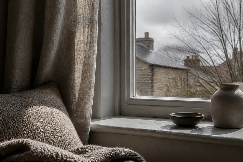
On a grey afternoon, the window can look pale while the curtain beside it appears almost dark. A winter window texture exercise begins with that small contrast: follow the light from glass to fabric, then notice what it does to the surfaces nearby.
You need no special equipment. Look from one spot, and choose just a few details: the curtain, a sill, and one soft furnishing or surface in view. A short comparison is enough; there is no need to record every change in the room.
Start with the glass and its light
Look at the window itself. On a dull day, the glass may seem like a flat, pale plane. A brighter patch of sky can bring out faint reflections, so the pane shows the room as well as the view beyond it.
Notice whether the light is even. A sash, roof edge or neighbouring building may divide the window into bands. The curtain, sill and wall can receive different amounts of light even though they sit close together.
Rather than labelling the room dark or bright, find where the window’s glow meets the deeper tone of the wall. Does that boundary fall sharply, or fade across a curtain or blind?
See how a curtain changes the view
Look at the surface of a curtain, roller blind, net panel or bare frame. A linen weave can scatter light unevenly. Velvet folds may hold deeper tones, while thin cotton can soften the outline of objects outside.
Folds create ridges and hollows, giving one piece of fabric several tones. A Roman blind’s stitched channels make small shadows; a curtain hem bending on the floor can form a darker line.
Consider what the fabric lets through. A sheer textile can preserve the sense of the outdoors while blurring its edges. A dense lining can make the window seem more solid. Neither effect is better; each changes how the room’s materials meet the light.
Compare the curtain with one soft furnishing
Choose a cushion, throw, upholstered chair or rug within sight. Similar colours can look quite different on different surfaces. Smooth cotton may seem crisp beside fuzzy wool; a tightly woven seat may appear quiet next to a rug with raised pile.
Look for one detail that distinguishes the materials. Wool fibres catch small highlights. Velvet’s nap can shift in appearance with the direction of its pile. Knitted loops show their structure, while brushed fabric blurs its edges.
The clearest texture may appear where a soft shadow crosses a surface, rather than where the light is strongest. If a cushion looks smooth from your seat, its weave may become visible up close; if not, it still reads as an even plane in the present light.
Follow one shadow across two surfaces
Find a shadow cast by the window frame, a plant or a curtain edge. Follow it across two materials. Its outline may be crisp on a painted sill, softer on a thick curtain, or broken by the raised pile of a rug.
A smooth wall can leave a shadow boundary easy to trace. Ridges in rough plaster interrupt it; knitted loops can blend it into the fabric’s own pattern. The surface affects how clearly the shadow reads.
Say you are sitting beside a north-facing window on an overcast afternoon, with a plain cotton curtain, a wool cushion and a painted sill in view. A brief brightening in the sky might make the sill’s shadow distinct while the cushion keeps a soft, mottled edge. The comparison shows how the same light appears across different materials, not that one has changed.
Notice the frame and sill
A window surround offers a close view of material. Painted timber may show brush marks, worn corners or a slight gloss. Stone and composite surfaces may look more continuous, though dust, condensation or an object on the sill can change their appearance.
Look at the join between frame and wall. A narrow shade can make the frame seem set back; a pale edge may blend into the wall. An object already on the sill can cast a shadow beneath its base, without needing to be moved.
A gloss finish may show a bright streak where a matt finish spreads the light more quietly. This is not a verdict on which finish belongs in a room. It helps explain why one patch of daylight can look sharper on part of the window and gentler on another.
Include one detail from outside
Choose a view through the glass, such as brickwork, bare branches, a fence or roof tiles. Attend to its surface rather than its subject. Brick joints form repeated relief; branches draw fine lines against the sky; rough stone holds dark marks in its recesses.
Compare that distant texture with something indoors. Branches may echo the open loops of a knitted throw without matching it. A brick wall beyond the glass can make a fine curtain weave seem more delicate by contrast. These relationships do not call for coordinated materials.
A busy view may make a plain curtain seem quiet, while a blank wall outside can draw attention to the sill’s grain. Let the view take part in the room’s appearance without treating it as another detail to manage.
Make one simple comparison later
If you want to see whether the light has shifted, return from the same place later. Choose one surface and check one feature: its brightness, visible weave, shadow shape or relation to its neighbour. If nothing looks different, leave it there; not every change in daylight is easy to see.
A brief note can help if you enjoy keeping one. Write a single observation, such as “the curtain looks grey near the frame” or “the rug’s pile shows in the light”. A catalogue of the whole room is not worth the effort; one clear detail is easier to remember.
Keep the room as it is
Look at the whole window area without deciding what should be added or removed. A throw may draw the eye because its fibres catch the light, while a smooth wall stays quiet. Surface, angle and daylight can account for that difference.
Chasing a perfect patch of winter sun or shifting furniture to create a more dramatic scene is not worth the effort. A cloudy window, a dim corner or a passing reflection still gives you something to notice. The useful result is a clearer sense of how the room’s existing materials appear in the light it has.
Questions about a winter window texture exercise?
When is a good time to look?
Choose an afternoon when you can pause without rushing, then return later if you want to compare. Overcast light can also make differences between nearby surfaces easier to notice.
Can I do this with a bare window?
Yes. Compare the frame, sill, wall and view beyond the glass, paying attention to their edges and surfaces. A curtain or blind is optional.
What if my room gets little daylight?
Use the light available and look for its boundaries, reflections and shadows. Even a subdued view can distinguish a smooth surface from a visible weave or raised fibres.
Do I need to change anything afterwards?
No. The observation can stand on its own. If you later choose to alter the room, make that a separate decision based on your needs.